-

My boyfriend and I just put up our weeping cherry tree and chandelier silhouette decals, and we can't stop admiring them! It was simple, fun, and they look very professional and modern. They completely changed the look and feel of our apartment. We can't wait to try more! Thanks, Dali Decals.
Tania Dudina
(www.SurpriseIndustries.com)
Added Aug 8, 2009 -
Fantastic! I ordered both a cherry blossom branch and a custom monogram decal for our nursery. They arrived promptly, went on easily, and look better than I ever expected! I am exteremly happy and will be a Dali Decals loyal customer for many years to come! Thank You!
Kabir
Added Jan 26, 2010 -
Recently upgraded the bathroom. Using 2 of asian papercut design in an alcove where the commode is, 2 of wild grass in a lt brown matte finish over painted coffee-colored walls above molding, alongside a large garden tub. The result is subtle. It looks like the design is painted on!
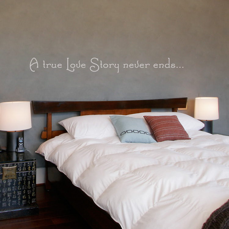
Last year I used dandelions behind the headboard in the master bedroom and I'm still receiving compliments. It's a pleasure to be able to purchase high-end, quality decals, with such a wide range of choices, colors and finishes... Kudos to you and your products
Dorothy
Added Aug 13, 2010 -
Just bought this for my grown-up "forest themed" bedroom. Not only does the decal look absolutely amazing, but it was very easy to apply and the company threw in a bunch of woodland animal decals for free. I will not hesitate to purchase in the future.
Amber
Added Apr 9, 2012 -
i love all of them
debby
Added Aug 20, 2012