
-

I ordered the Victorian Flowers - Personalized Monogram wall decal and it looks absolutely beautiful in my living room. It was easy to put up, and I plan on ordering more decals in the near future.
Renee
Added Nov 19, 2010 -
I just had to write in and let everyone know how easy these are to use! I thought it was going to be difficult but it really is super easy! My decal looks great! Wish I would have done it a long time ago!
Lacey
Added Apr 3, 2011 -
We love it! They are very easy to apply and we're already looking at getting more for our other rooms!
J Daniel
Added Jan 4, 2012 -
I ordered the Hidden Corner Branch with Falling Leaves and I couldn\'t be happier. It was not difficult at all. The overall appearance is absolutely beautiful. It really livened up my entryway. Before placing my order, I contacted them with a question and they supplied me with the information that I needed in order to continue with my purchase. Thank you Dali Decals!
SAHM2Boyz
Added Apr 1, 2013 -
I purchased the Giant Mums wall decals for our nursery. I just hung them yesterday and they are beautiful. Easy to apply and look great! I'm very happy and would definitely recommend them.
Casandra
(http://www.headeasthome.com)
Added Nov 12, 2014
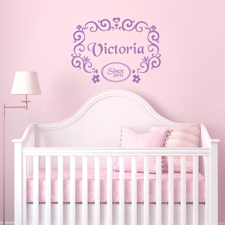
Detailed Images:

