-

I just absolutely LOVE Dali Decals!! I started off with just one funny one for our toilet, then ordered another one for my living room, then another one for my friend's baby room and now yet another for my spare bedroom. They always get so much attention when company comes over. Such a great idea for a wall that just needs "something" extra. And I have to say....Dali Decals customer service is THE BEST (always so nice and they have a way of making you feel as though you are their friend)!!! I will be a loyal customer for quite a long time. Thanks Dali!!
Barb from Phoenixville, Pa
Juicy3520
Added Mar 10, 2010 -

I recently purchased several custom orders for my office. I worked with Alicia, and she is fabulous. She promptly answered all of my questions (and I had several!), and she made sure that my order exceeded my expectations. I look forward to receiving my shipment, and I will be referring clients, friends and family to your company. Thank you Alicia and Dali Decals!!!
Kaela
(Trinity Sanctuary, Inc.)
Added Jan 27, 2011 -

When I purchased my Dali Decal I told them I first heard of them via Tugg :):) They threw in a few extra Decals, they are SO sweet! Everyone at my office is very impressed with how awesome my decal looks, several folks asked me for their website :):) YAY for Tugg spreading positivity EVERYWHERE! Have a great weekend!
http://www.facebook.com/TuggBullTerrier
Alana D.
(http://www.facebook.com/TuggBullTerrier)
Added Apr 2, 2011 -

I just wanted to say I LOVE my new Dali Decal !!! I just finished putting the last leaves on the tree and it looks fantastic. It was very easy to put up, following your instructions. I also love all the little extras that were included. What a nice surprise!!
Stephanie
Added Jun 2, 2011 -

We used Dali Decals for a custom designed decal for our daughter's nursery almost 3 years ago. I sent them an even more challenging design for baby #2 who is due any day now. It arrived so quickly that I was sure there had to be some mistake. It is perfect and we could not be more pleased. Thank you!
justinandkasey
Added May 21, 2013
Color Chart
We have over 80 colors to choose from, and if you need a specific color, we offer color matching services.Need a Customization?
Our experienced and talented staff of designers and decal experts are here to help you with any questions or customizations you might need.Installation is Easy!
Our step by step installation instructions are so easy to understand, anyone can install decals!Description
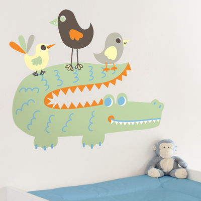
Bring the jungle to your child's bedroom with our Friendly Alligator and Birds printed wall decals! Our Printed Decals are easy to apply and are ideal for any smooth and flat surface! If your walls have any texture, we recommend purchasing a Printed Test Decal Sample Pack first.
Dimensions:
Dimensions:
- As shown: 32 inches wide by 27.5 inches high.
- Alligator: 32 inches wide by 16.5 inches high.
- Birds from left to right: 8.5 inches wide by 7.5 inches high, 9 inches wide by 12 inches high, 8 inches wide by 7.5 inches wide.
- Decals will come in the colors shown.
- Any adjustments are available for an additional fee, just contact us!
- Comes laid out in sections for easy application and so that you can create your own look!
- All Printed Decals have a matte finish.
- Practice decals are included with every order.
Testimonials
Copyright © 2006-2026 Dali Wall Decals


