-

WOW! I was blown away by the rapid response and superb customer service. Alicia was fantastic! She worked very closely with me to make sure that I was happy with my purchase. The shipping was lightning fast too. I can't wait to see what it looks like on the wall, but that will be a project for next weekend :)
soon2btmc
Added Jul 8, 2008 -
The inventory is amazing and customer service is outstanding!! We ordered the giant corner tree with leaves, set of six birds and a monogram for our daughter's room. We love this company and would recommend it to anyone.
jtakac
Added Jul 21, 2009 -
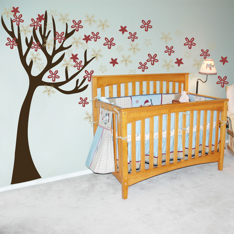
My wife and I bought the "Tall Tree Waving in the Wind" and the "Swirling Poppies" decal sets for decorating our nursery, and we're very glad we did - they're so cute! We were a little intimidated by the process of putting up the tree at first, but with the help of the video tutorial on the site, we found it was actually very easy. Everyone who comes over raves about how great the decals look - we're surprised by how many people actually think the matte decals were painted on as they look so thin and smooth! You can see a photo of the tree decal in our nursery at http://www.flickr.com/photos/jasoncross/4560458147/
Jason Cross
(http://www.flickr.com/photos/jasoncross/4560458147/)
Added Apr 28, 2010 -
I have purchased 5 items and love them. The most recent being "The most important things in life are not things" in beige and the word "things" in silver. All i can say is "WOW"! It matches the color of my bedroom furniture PERFECTLY and becomes such a nice focal point on my taupe colorwashed walls. I also did "Relax" on my bathroom wall over our roman tub and it looks amazing in chocolate on my cream walls. Thank you for being affordable and for providing such an easy DIY project! Will be ordering more soon! (Pictures submitted)
Adrienne S.
Added Jul 16, 2012 -
I moved into this house almost 3 yrs ago and have a vaulted staircase. I had no idea what to do with it until I saw this Cherry Blossom Tree.. I have had this decal for about 2 yrs and still get compliments on it. The staircase is a multi level staircase and I had the flowers float up the wall like the wind was taking them away. We recently moved and the tree had to come down. Boo! I have to say though after two plus yrs. the decal came off and left no residue and took no paint off. I am trying to figure where I want my new family tree now in my new home. Thanks for making great decals.
Stacey S
Added Sep 24, 2013