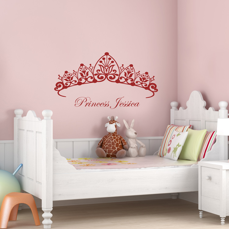
-

I finally got up the courage to install these decals. I have a slight orange peel texture on my wall and was worried about my new paint in my bedroom getting messed up. BUT....application was a breeze and it was easy to reposition the decals, even without using the soap and water mixture. I think the orange peel under them even enhances the look! I love them and will be recommending them to friends.
Irisgrrl
Added Apr 14, 2008 -

Great product. Looks fantastic and very easy to install
ABalboa
Added Dec 26, 2009 -

Thank you for an amazing product; I could not be happier with my decal. Application instructional video was very helpful and made application a breeze. You have got yourself a repeat customer for sure!!
Londa K
Added Jun 18, 2012 -

The Cherry Blossom Tree decal more than exceeded my expectations. I completed the install by myself, which was only slightly challenging. One suggestion I would make for other people who get this decal is that cutting the sections into smaller sections makes placement both easier and more accurate in terms of alignment. One other suggestion I would make is for people who are considering this decal to examine the layout of the wall they are considering in correlation to any light sources. I did not get the matte color option, so at times there can be a glare on the decal, as it was placed directly across from a window. All in all, my entire experience with Dali was excellent. The delivery was quick and the extra decals that were included went perfectly with the scheme I had planned. I will definitely be using this company again.
Brent
Added Jun 19, 2012 -

I love my inspirational quote decal! It\'s on the wall in my bathroom. It was pretty easy to put up. Although I admit I did try to make rocket science out of getting it perfectly straight. But I knew once it was up it was there to stay so I wanted to get it right. In hindsight I should have spaced each line a little closer. But I didn\'t realize that until I peeled the paper backing off. Not a big deal. I\'m still very happy with the end result. I chose dark grey matte to go against a pale blue wall. I\'m glad I did. It reminds me of the color of pencil lead, which looks nice in the script font. I like it.!
Maureen
Added Apr 17, 2013

