-

We are so happy with the tree decal we ordered! We put it up in the nursery for our new baby boy, Jack. All visitors and relatives over the past few days have been blown away by the tree and eager to log on to your site and cruise around. I hope it means more traffic to your site and more sales, too! We'll be coming back again; that's for sure.
Thanks again, so so much. Great product, clear instructions and an amazing result once installed. And the extras! So kind and unexpected. The little birds you packed in there for us are so cute.
Cheers and best wishes to you and your wonderful company.
Corey B
Added Jun 30, 2009 -

The Cherry Blossom Tree decal more than exceeded my expectations. I completed the install by myself, which was only slightly challenging. One suggestion I would make for other people who get this decal is that cutting the sections into smaller sections makes placement both easier and more accurate in terms of alignment. One other suggestion I would make is for people who are considering this decal to examine the layout of the wall they are considering in correlation to any light sources. I did not get the matte color option, so at times there can be a glare on the decal, as it was placed directly across from a window. All in all, my entire experience with Dali was excellent. The delivery was quick and the extra decals that were included went perfectly with the scheme I had planned. I will definitely be using this company again.
Brent
Added Jun 19, 2012 -

Great product, and easy to install! We purchased two trees, and they look great! Thank you!
Judie
Added Aug 7, 2012 -

We got the decal (Happy Owls & Birds in a Colorful Tree) on Friday and just put it up today. It took about an hour (including cutting up the big roll into sections) to put up! So easy (and I'm 39 weeks pregnant)!
Looks fantastic! This picture is the view from my nursing chair in the baby's room.
We are going to use the orange owl color as an accent color around the nursery.
Love love love it!!
Thanks again for wonderful service!
Jenn
Jenn K.
Added Sep 4, 2012 -

Good morning,
wanted to say thank you for such great customer service & quick responses! I wanted to also thank you for the extra decal of my son's name. It turned out awesome and I have attached a picture!
Thank you,
Precious L
Precious L
Added Jul 12, 2016
Color Chart
We have over 80 colors to choose from, and if you need a specific color, we offer color matching services.Need a Customization?
Our experienced and talented staff of designers and decal experts are here to help you with any questions or customizations you might need.Installation is Easy!
Our step by step installation instructions are so easy to understand, anyone can install decals!Description
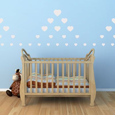
These sweet Scattered Hearts will look beautiful in any room!
Create a dream-like space anywhere you choose. These wall
stickers are ideal for a playroom, bedroom, entrance, foyer, garage
door, laundry room, dorm, apartment,
office,
your child's space, or anywhere with a smooth, flat surface!
Dimensions:
Display Image Info:
Dimensions:
- Sizes of hearts range from 2 inches to 5 inches. You will receive 75 hearts in 3 separate colors (25 per color) to apply however you like!
- You will receive enough heart decals to recreate the look shown here.
Display Image Info:
-
Sizes range from 2 inches to 5 inches.
- You will receive enough hearts to create the design shown in the picture!
- Color shown - White Matte. (but you can select up to 3 colors!)
- Our Scattered Hearts come condensed on one sheet per color, to be
cut apart before applying. This allows you to create your own look!
- Practice decals are included with every order.
Testimonials
Copyright © 2006-2026 Dali Wall Decals


