-

These wall decals are superb. We've tried a few from different sellers, and so far these are the easiest to install. Communication was friendly and shipping was prompt. Thank you!
tuxedo73
Added Jul 15, 2008 -

Absolutely LOVE this!!! Perfect for our playroom!!! Can't wait to shop for more! Thanks SO much!!
gigglegarden
Added Aug 7, 2008 -

My husband and I took about two to three hours putting the large Dandelion Blowing in the Wind - Wall Decals up in our daughters nursery. He is some what of a perfectionist so it took us a little longer then most .
When I had my baby shower my family and friends raved about how good it looked and could not believe it was a decal. The Transition from the decal to the wall was seamless. The final outcome was Absolutely Gorgeous !
We love Dali Decals!
New Mommy Mel
(na)
Added Aug 15, 2010 -

We LOVE our tree. I just got it put up today and it looks fabulous. Everyone who has seen it loves it and asks where I got it. Thank you thank you!
Little Monkies Preschool
(Little Monkies Preschool)
Added Jun 25, 2011 -

Overall I'm EXTREMELY satisfied by the decals I ordered from Dali. We have textured walls, and it was rather difficult getting the decals to stick, but after applying a clear coat sealant over the decals, we haven't had any peel off. The decals look AMAZING and the colors are spot-on! I will definitely be using Dali again, and I'd also recommend others to use them as well! Thanks Dali!!
Brandon Rogers
Added May 20, 2012
Color Chart
We have over 80 colors to choose from, and if you need a specific color, we offer color matching services.Need a Customization?
Our experienced and talented staff of designers and decal experts are here to help you with any questions or customizations you might need.Installation is Easy!
Our step by step installation instructions are so easy to understand, anyone can install decals!Description
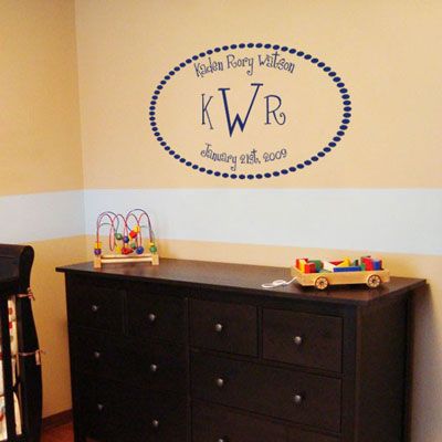
This three letter monogram wall decal is a classic way to display your child's full name, initials and birth date!
This personalized wall decal measures 22" high by 36" wide. It's shown here in our matte navy blue, but available in all of our colors! Perfect for a boy's or girl's nursery!
Need a different size? Just contact us!
This personalized wall decal measures 22" high by 36" wide. It's shown here in our matte navy blue, but available in all of our colors! Perfect for a boy's or girl's nursery!
Need a different size? Just contact us!
Testimonials
Copyright © 2006-2026 Dali Wall Decals


