-

I bought the boy blowing bubbles and the girl blowing bubbles and I also bought bubbles in three colors. I used them in a boy and girl nursery and this room ROCKs! This was not my first experience with decals, and thought I had nice quality in the past, but Dali Decals has raised the bar! I will never buy from anyone else! EVER! I am planing my next project now and I can't wait to see what else I can do! I will send you pictures ASAP.
Thank you so much =)
Happy Mommy
Andrea
Added Mar 15, 2010 -
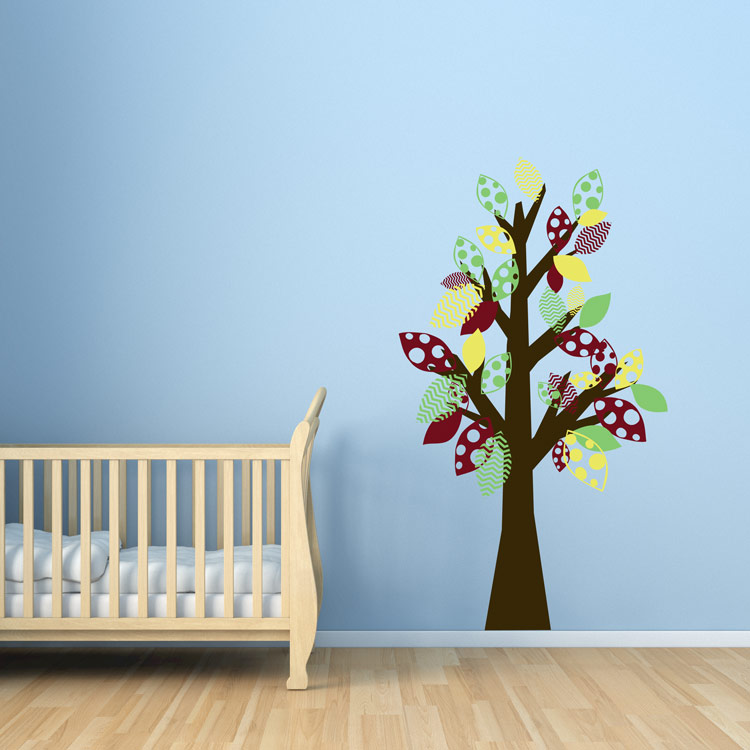
We were really nervous about doing this. When our decals arrived we were shocked at how fun and easy it was to apply them. We cut them out and hung them on the wall in different ways using painting tape first to decide exactly where we wanted leaves and blooms. So much fun! Everyone keeps telling us how terrific and professionally done it looks.
Danielsmom
Added Aug 11, 2010 -
I'm in love with Dali decals! Not only are the decals amazing, but the sales department is top of the line. I'd recommend them to anyone!
chloedpd
Added Nov 24, 2010 -
I just completed a large project for a church nursery. I ordered decals from three different companies, but Dali Decals were my hands-down favorite. They stick well and look amazing. The staff was easy to work with and helped me to customize decals that fit perfectly for our space. Thank you!
Rachel
Added Dec 28, 2012 -
I love my inspirational quote decal! It\'s on the wall in my bathroom. It was pretty easy to put up. Although I admit I did try to make rocket science out of getting it perfectly straight. But I knew once it was up it was there to stay so I wanted to get it right. In hindsight I should have spaced each line a little closer. But I didn\'t realize that until I peeled the paper backing off. Not a big deal. I\'m still very happy with the end result. I chose dark grey matte to go against a pale blue wall. I\'m glad I did. It reminds me of the color of pencil lead, which looks nice in the script font. I like it.!
Maureen
Added Apr 17, 2013