
-

Wow, I just ordered this and it's alreay here and wonderful. I just put it on our entry way closet door and it's just perfect. Thank you so much.
kcmisme
Added Jul 7, 2008 -
Had them both up within an hour of ups rolling away. :-) Couldn't be happier with the product and service!!
I could NOT be happier! Will definitely be back soon...just need to decide what else I need. THANK YOU!!
jkduncan
Added Sep 4, 2008 -
Just a quick note to let you know how wonderful the decal is that we ordered from Dali Decals! It is the perfect addition to our babies nursery and it was so easy and fun to put up! My husband was most impressed that our tree looked as good (if not better) that the picture from the internet that we used as our guide! Thank you so much for brightening up our son's room! I would recommend your website and product to all!
Smiles,
Megan & Loren
Megan & Loren
Added Sep 14, 2009 -
I love these! Our walls are textured & these decals still stuck great on them. The color was also very accurate & they are adoreable! Would definately recommend ordering some.
jberens
Added Jun 10, 2010 -
I love my musical notes, perfect addition for over my jukebox. easy and professional looking installation. thanks for the quick processing and shipping on my special order.
Dave Barocas
Added Jan 14, 2011
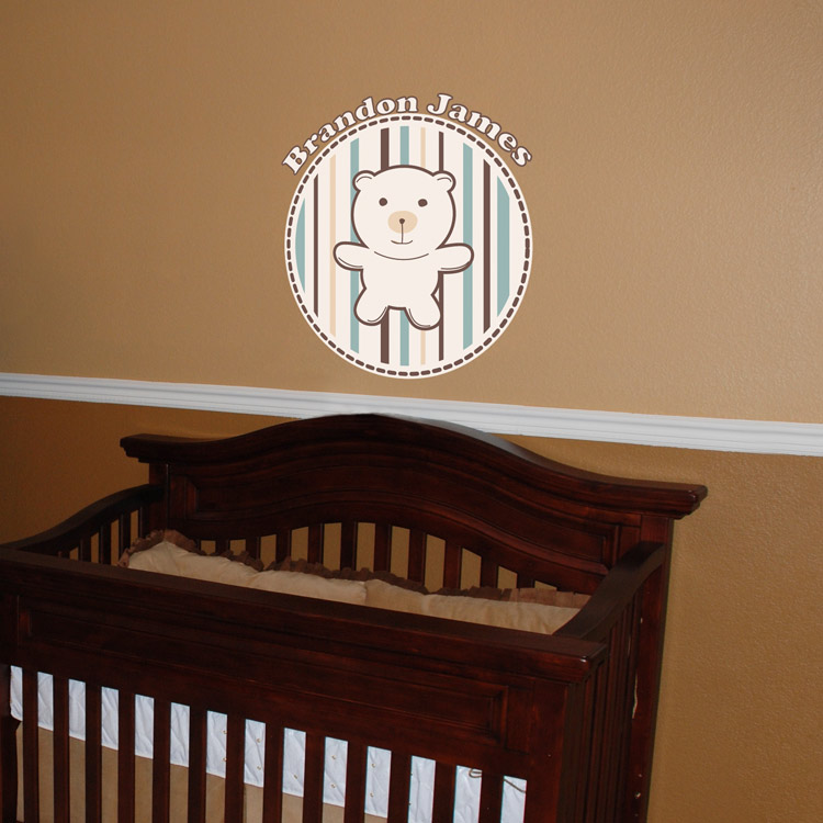
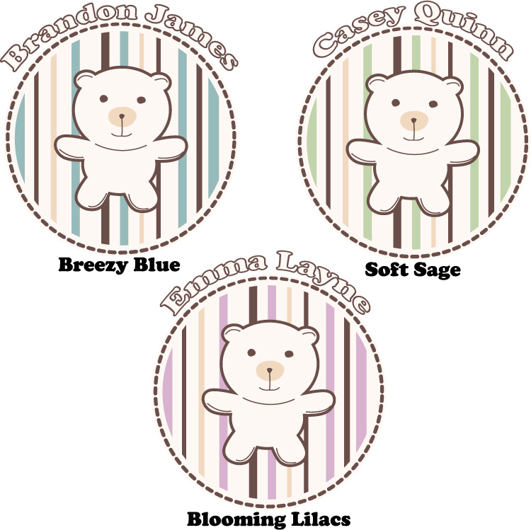
Detailed Images:

