-

Received exactly as advertised. Shipped quickly. Decals went on easily and are very high quality. I recommend highly to others
satori9876
Added Jun 21, 2008 -

My wall decal from Dali arrived at my house (in Ontario Canada) 2 weeks after I purchased it! It was very easy to put up (we needed about 3 sets of hands for some areas) and it is absolutely beautiful. Everyone who sees our Tall Tree with Leaves Blowing in the Wind is amazed by how awesome it looks! I was also super excited to see all the free extras they included with my purchase. I highly recommend Dali for any wall art. Love it love it love it!!!!! Thanks again....Krista:)
Krista M
Added Aug 12, 2010 -

I bought this and never regretted it! It is beautifully made and by far the perfect centerpiece for my home.
Kristin W
(http://www.hardlyawkward.blogspot.com)
Added Apr 6, 2012 -

I have to admit after receiving my decals (which arrived days before it was supposed to) I got nervous. I ordered a larger decal but everything went so well-it does take some time but the results are great! I find myself stopping to look in my dining room often to admire my work-company coming tonight and can't wait to hear what they have to say. I've already got another decal in mind for a bedroom :)
Robin Dettbarn
Added Sep 25, 2012 -

I moved into this house almost 3 yrs ago and have a vaulted staircase. I had no idea what to do with it until I saw this Cherry Blossom Tree.. I have had this decal for about 2 yrs and still get compliments on it. The staircase is a multi level staircase and I had the flowers float up the wall like the wind was taking them away. We recently moved and the tree had to come down. Boo! I have to say though after two plus yrs. the decal came off and left no residue and took no paint off. I am trying to figure where I want my new family tree now in my new home. Thanks for making great decals.
Stacey S
Added Sep 24, 2013
Color Chart
We have over 80 colors to choose from, and if you need a specific color, we offer color matching services.Need a Customization?
Our experienced and talented staff of designers and decal experts are here to help you with any questions or customizations you might need.Installation is Easy!
Our step by step installation instructions are so easy to understand, anyone can install decals!Description
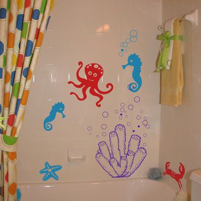
Go on an underwater adventure with our sea-themed wall decals! Our underwater sea decals are perfect for the bathroom, even on tile! Shown here in our cardinal red, ocean blue, and purple, but available in up to three colors of your choice!
Our decals measure as follows:
Coral Reef - 19" wide by 20" high
Big Seahorse - 7" wide by 12" high
Little Seahorse - 5" wide by 9" high
Octopus - 14" wide by 14" high
Crab - 12" wide by 10" high
We include two sets of bubble decals for you to place however you like! They will come in the same color as the seahorses and coral.
Note: While both matte and semigloss will work, we recommend our semigloss colors for longer term bathroom/tile/shower applications, as they have a stronger adhesive and work better with wet and humid conditions.
Testimonials
Copyright © 2006-2026 Dali Wall Decals


